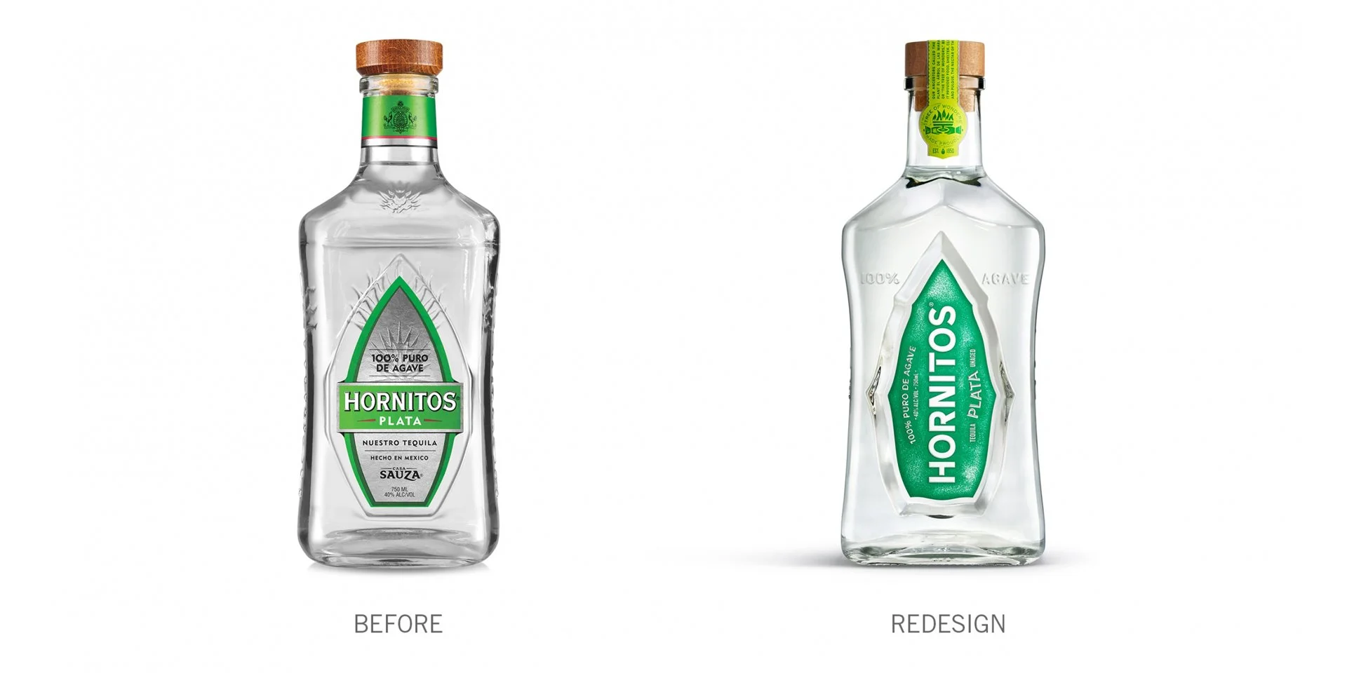
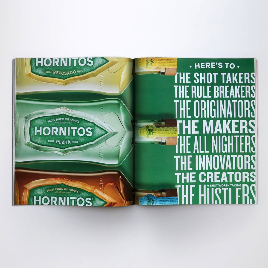
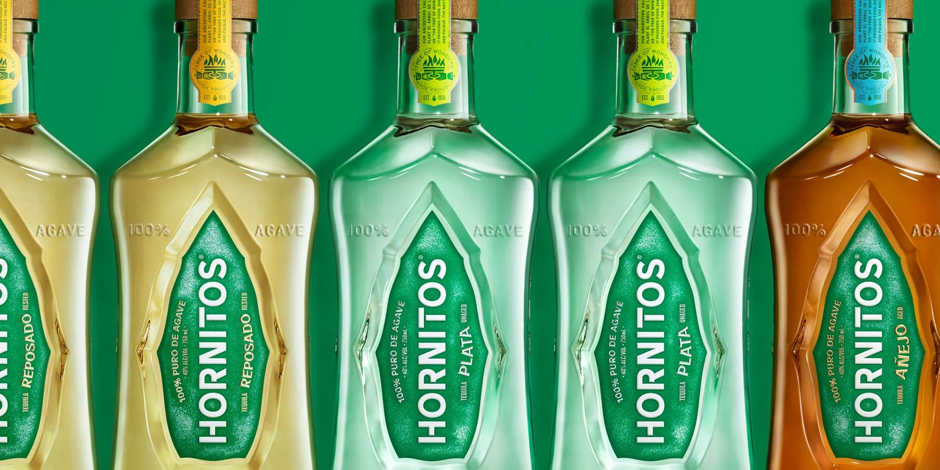
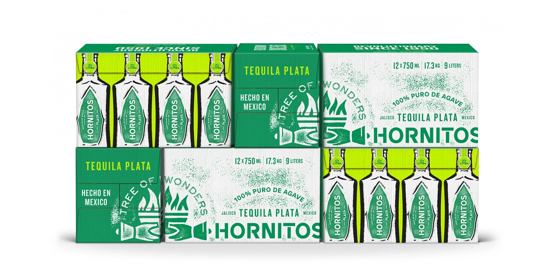
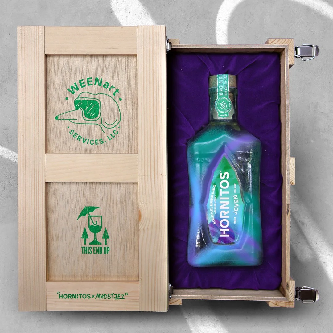
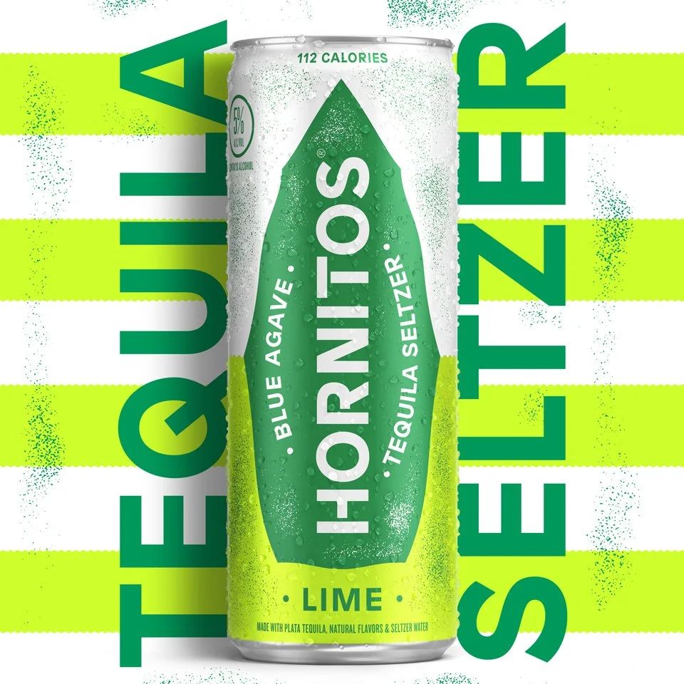
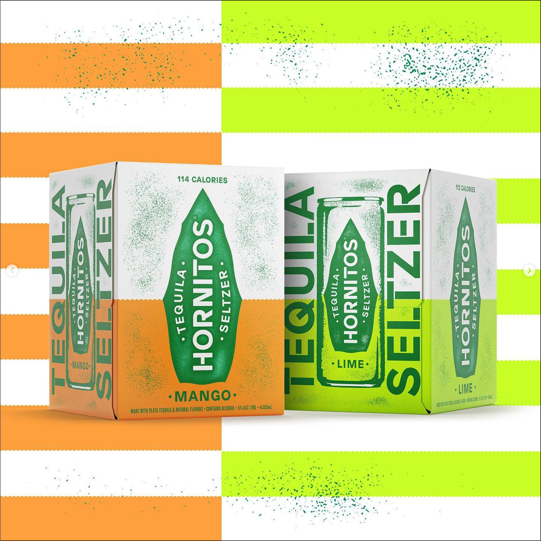
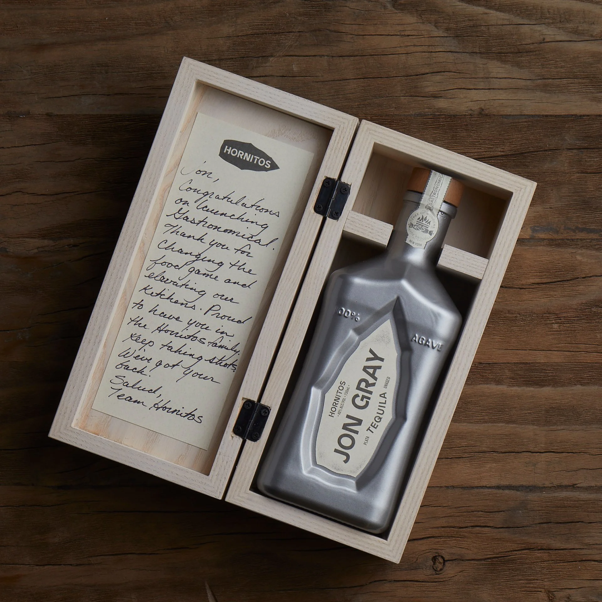
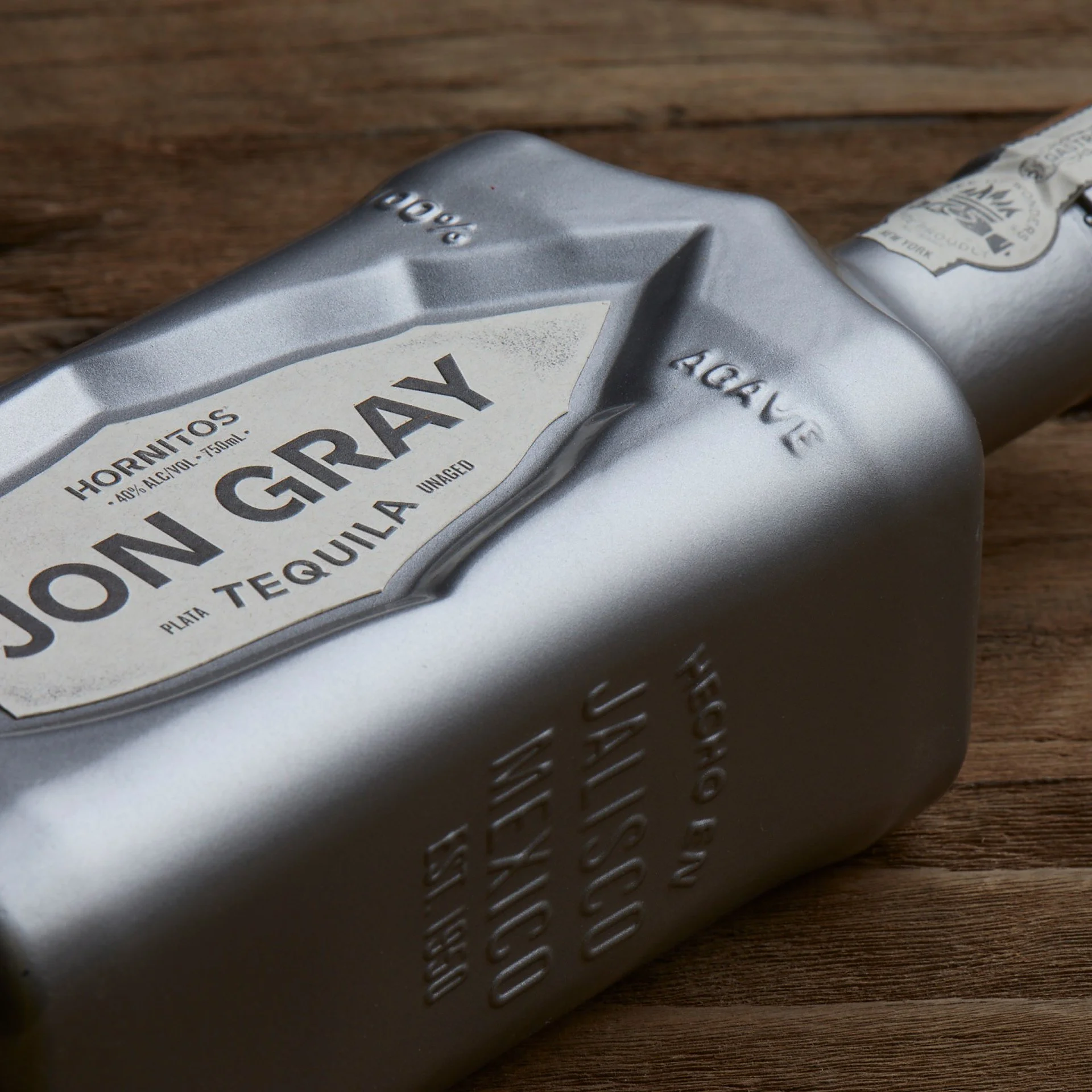
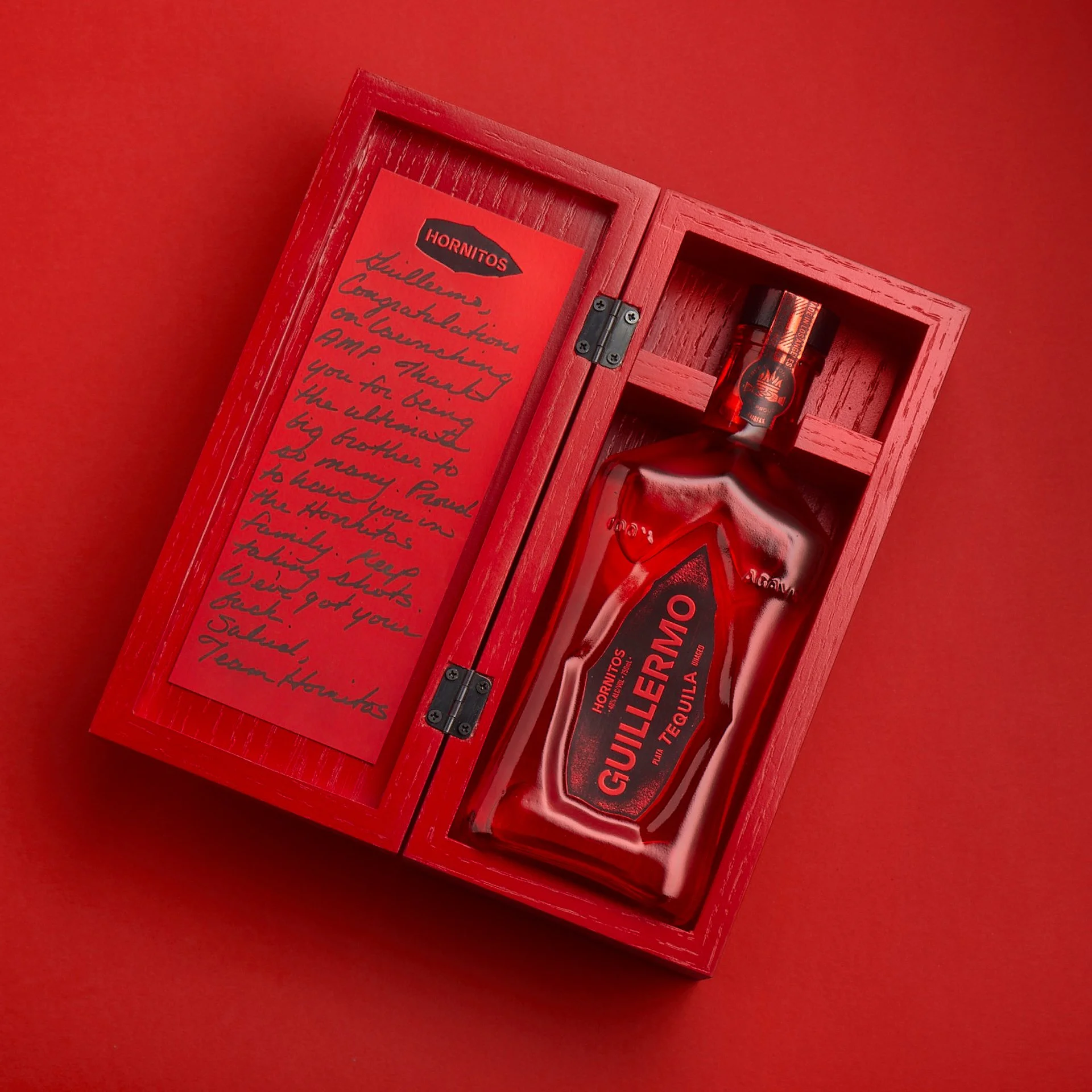
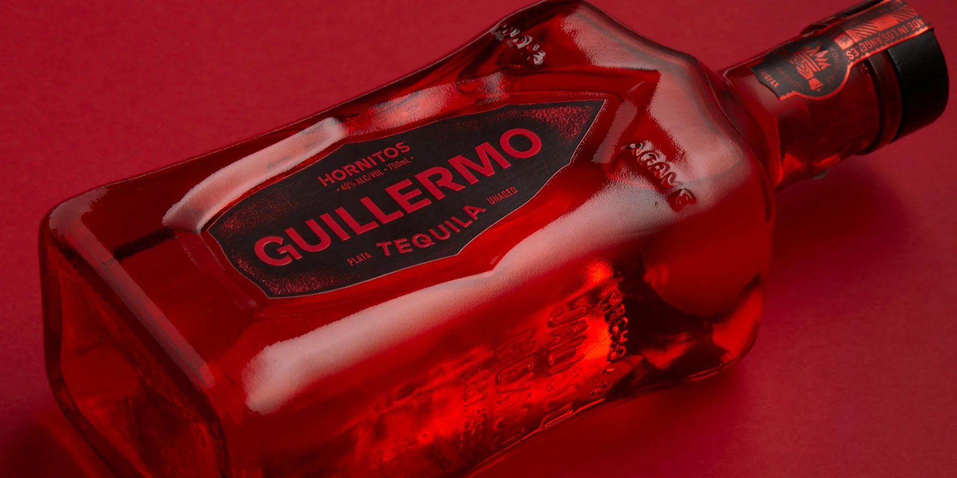
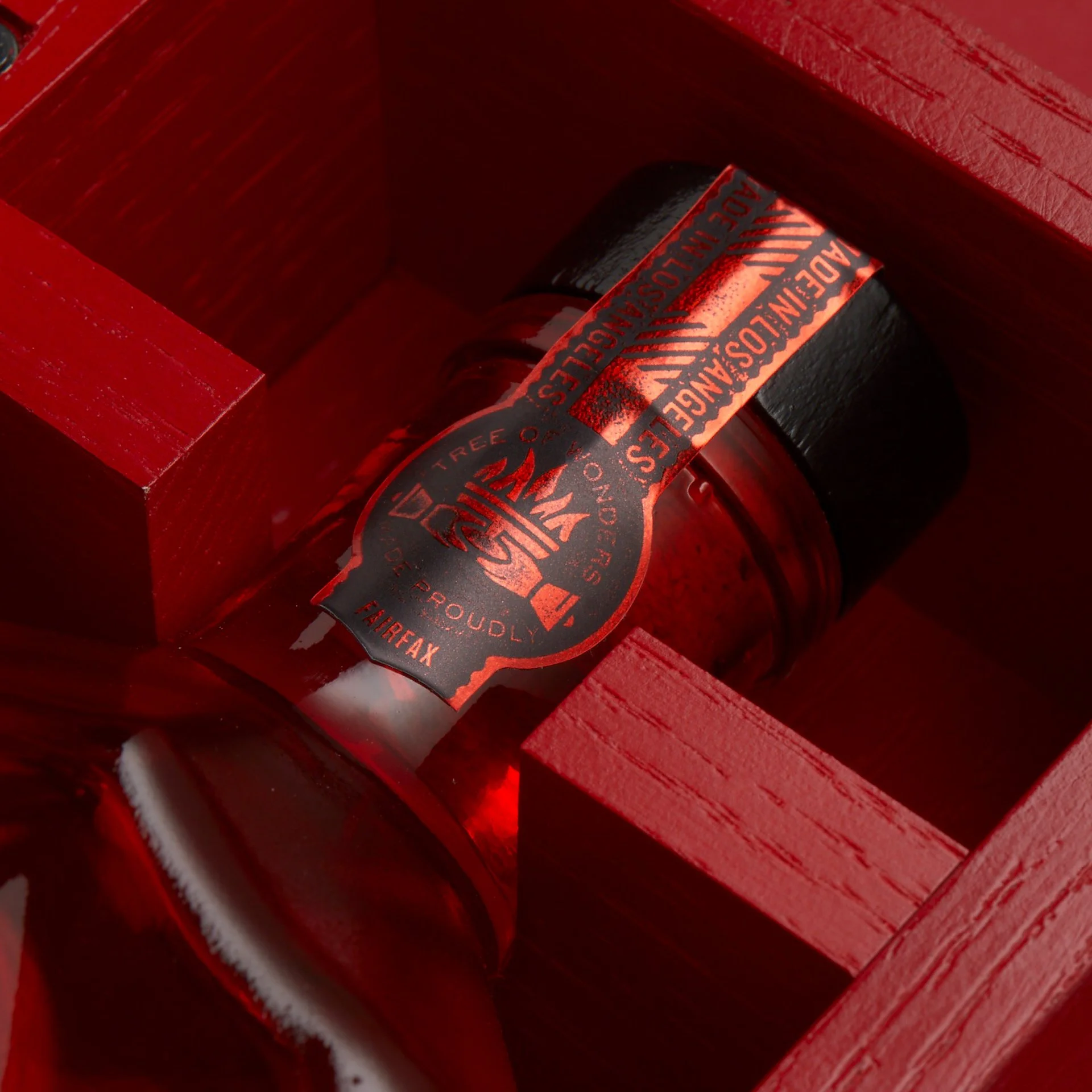
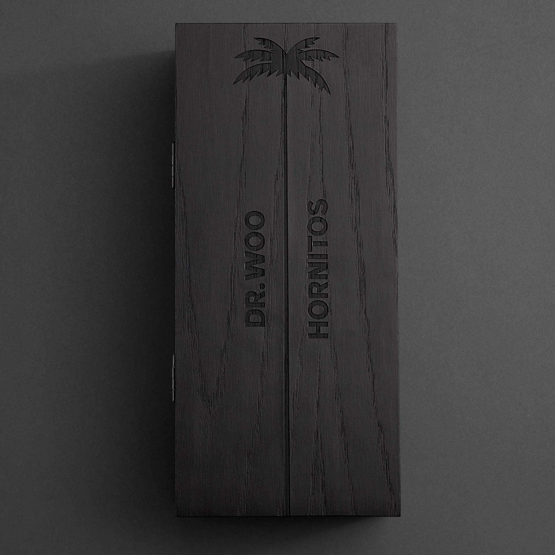
The Hornitos rebrand covered several years and touched almost every aspect of the Beam-Suntory tequila brand. Bottle structures; labels; logos; color and typography; advertising including print, OOH, & TV; environmental graphics; special edition 1-off packages; shippers; asset kits; photography; bottle visuals; and more, covering core offerings, premiums and on to new products.
Contributions
Anything post-design was touched or worried about by me. Helping designers assess and modify bottle drawings, dialing in color, building mechanicals, creating complex bottle visuals and asset kits, proofing, working with vendors to create comps and influencer 1-offs, stewarding work created by other agencies and teams, liaising closely with Beam’s in-house production teams, troubleshooting unique printing requirements…the list goes on.
Results
Significant increase in quantifiable visibility & recognition on shelf. Only 8-10% of packaging redesigns achieve this. Sales volume for the brand has doubled since redesign.
Graphis Gold, Drum Award


